

You’re an amazing programmer! But when it comes time to code something public-facing, your design skills fall short. You know things look bad, but you don’t know why, and you don’t know how to fix it.
Why should developers learn design?
Programming skills combined with design skills are a superpower! With both at your disposal, nothing is outside of your ability to create.
Note: This article in no way implies that all programmers are bad at design, or need convincing to learn design. I could write a whole post just on talented programmers that are awesome at design. And if you’re reading this, you probably already know that you want to improve your design skills! Maybe your manager needs convincing to allow developers to spend time on user interfaces to hone their design chops. Or you just need a few tips on how to get your front-end work to look polished. This article is for you.
Even if you don’t want to be a designer, having an understanding of design will take your programming to the next level. Maybe you work on a team with designers. Give them the confidence to hand off designs without destroying the design’s integrity. Or maybe you’ve been putting off building that side-project because you just don’t know how to make it look good, and you don’t want to hire a designer.
Search the internet for how to learn design and you’ll find countless resources teaching high-level design concepts like Gestalt principles, metaphors, and color theory. Or you may be overwhelmed trying to choose the right design tool.
So you chalk up design as something that either:
- can’t be taught
- requires years of intense study
But I have good news! You don’t need to be the next Milton Glaser. You just want to make things that look nice. If you’re looking to improve your design skills, there is one simple design principle to keep in mind that will take your work to the next level:
Be Consistent
Really? That’s it?
Yes!
Let’s breakdown consistency for UI design.
Typography
Typography may be the most important aspect of your design because often text is the bulk of your content. Writing is one of the most fundamental forms of communication, and typography has a deep history that spans centuries of evolution. But you don’t need to know all of that. Just be consistent with your typography. Follow these guidelines and make your typography beautiful.
Font
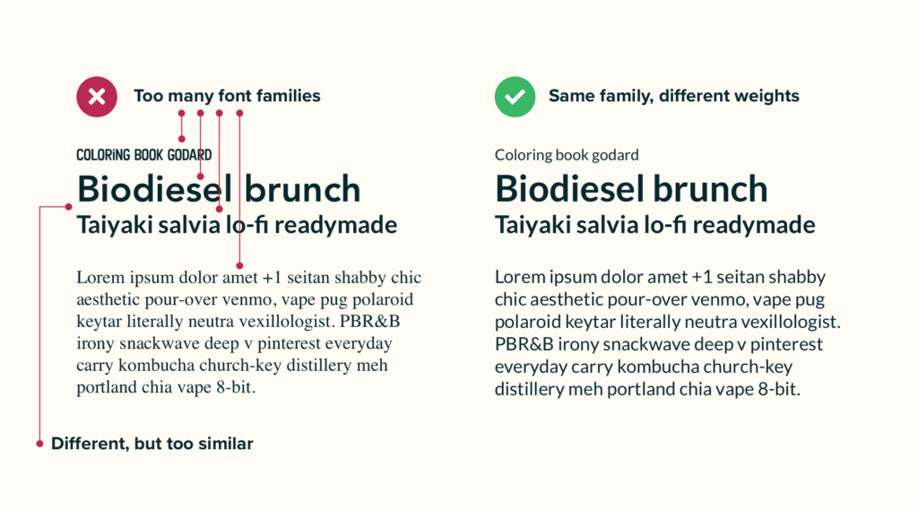
Choose one or two fonts for your design. If you use two fonts, stick to one font family, or use two distinctly different font families. Don’t use two different but very similar families. You can find some nice font pairings on Typewolf.
Size
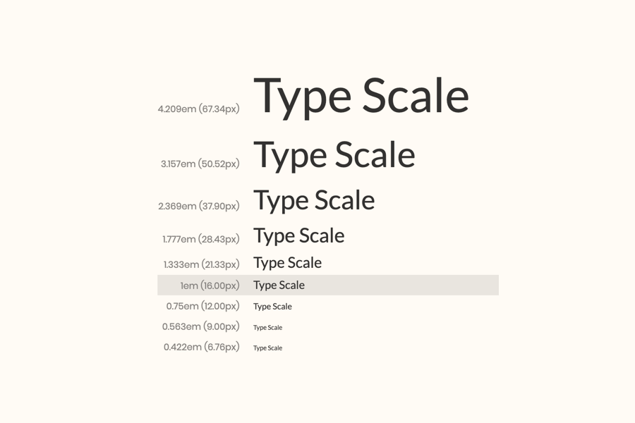
Use a tried and true type scale system, and adhere to it. Find one at Type Scale. You can’t go wrong with the Perfect Fourth ratio.
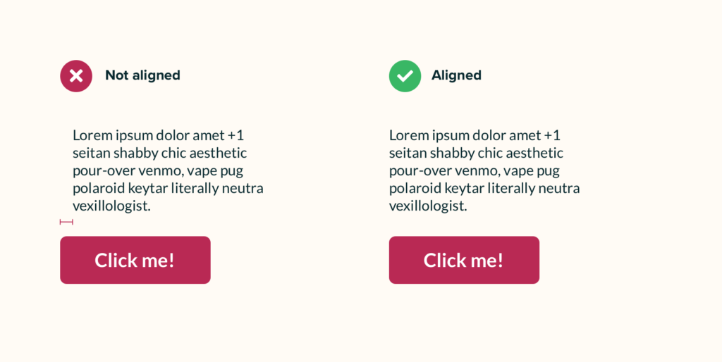
Alignment
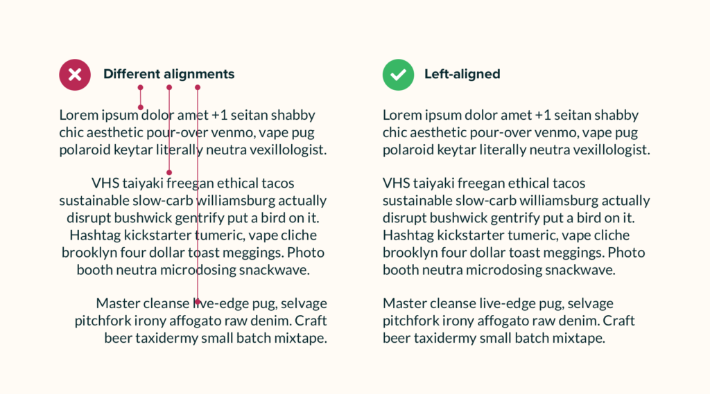
Left, center, or right. Pick an alignment and don’t stray.
Color
You can go down a rabbit hole with color theory. Let’s stick to the basics. Follow these guidelines for a consistent, gorgeous color palette.
Temperature
Warm or cool. Pick a temperature, and use it for the bulk of your colors. Stick to analogous colors as a base. Adobe’s Color wheel can help.

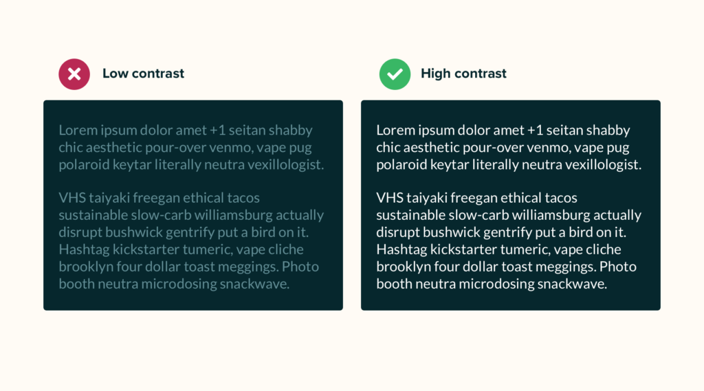
Contrast
Most of your colors should be muted. Pay attention to foreground and background colors. If you have a dark background, use a light foreground. If you have a light background, use a dark foreground. Check your color contrast on WebAIM.
Accent
Pick one bold color that stands out in your color palette to highlight key features and to capture attention. This can directly contrast with your other colors’ temperature. Check out the Material Design color system for proper examples.

Layout
The layout is the structure of your design. Keep it consistent and you’ll find it easy to use and easy on the eyes.
Alignment
Make everything align. A grid is a great way to keep all your elements in alignment.
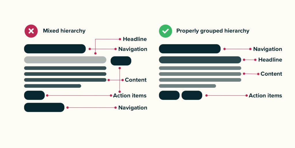
Hierarchy
Build a consistent hierarchy. Keep important content more prominent. Group similar conceptual elements together.
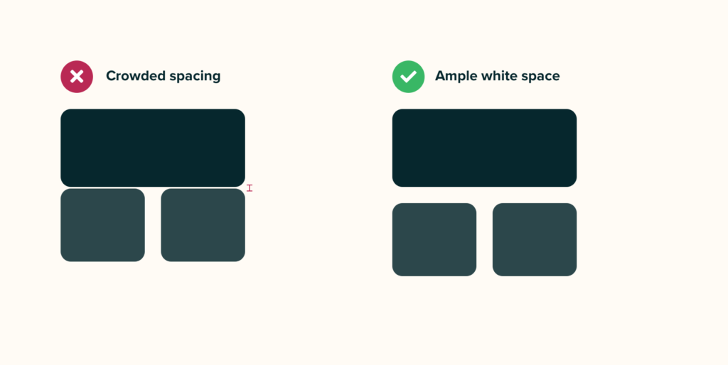
Space
Use consistent white space to organize your layout. This keeps things simple, separate, and pretty.
In Conclusion
Simple enough? Stay consistent in your design decisions, and your work will feel cohesive and well thought out. And consistency can be applied to virtually every aspect of your design:
- Tone
- Iconography
- Photography
- Line weights
- Capitalization
Of course, rules are meant to be broken, but until you fully understand the fundamental principles, try not to stray from these guidelines. There’s lots more to learn, but these tactics will get you well on your way!
Are you a programmer that’s improved their design chops? I’d love to hear what worked for you!
Thanks for reading, and keep making! 🚀